 Click on each term to learn more.
Graphs are pictorial representations of data. In other words, graphs can show us a picture of data. Plotting the position or distance over time can tell you a lot about the motion of an object.
First, let's take a closer look at the parts of a position vs. time graph.
Click on each term to learn more.
Let's look at some motion data and see how it translates to a graph.
A car is traveling at a constant speed of 15 kilometers per hour and travels for a total of 5 hours. If we create a data table and graph for this data, it would look like the data table and graph shown below. Since the car is traveling at a constant speed, what would the distance traveled be at the 2 hour mark?
Click in the data table to check your answer. Pay close attention to what is happening in the graph as well.
The graph below shows data from two moving objects. Both lines are straight, so both speeds are constant. Both of the lines in the graph show that each object moved the same distance (50 km) but the steeper green line got there before the other one.
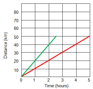
At what speed was the object represented by the red line moving?
Interactive popup. Assistance may be required. 10 km/hour. If you are having trouble determining this, look at the distance it traveled at the one hour mark. Since the line is a slanted straight line, the distance traveled at the one hour mark will be the rate.
At what speed was the object represented by the green line moving?
Interactive popup. Assistance may be required. 20 km/hour. If you are having trouble determining this, look at the distance it traveled at the one hour mark. Since the line is a slanted straight line, the distance traveled at the one hour mark will be the rate.
On a position vs. time graph, a steep line indicates that a distance was traveled in a short amount of time. In other words, the object moved at a high speed.
We know that not all objects travel at a constant speed. Objects can increase in speed (accelerate) or decrease in speed (decelerate).
Position vs. time graphs that show changes in speed look different from those that show constant speed. Let's look at how they differ.
Let's say a car is traveling on a road and, over time, increases in speed. The data table and graph would look like the data table and graph below.
Click in the data table to see the remaining data. Pay close attention to what is happening in the graph as well.
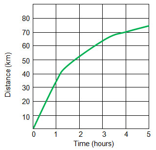
In the graph to the right, the line is curved to the right. This is showing a decrease in speed. It is taking longer for the object to travel.
For example, how far did the car travel in the first hour?
Interactive popup. Assistance may be required. 32 km
How far did the car travel in the last hour?
Interactive popup. Assistance may be required. About 5 km
What happens if an object stops moving? How is this represented on a position vs. time graph? Let's say a car is moving at a constant rate for 2 hours, and then it stops moving for 3 hours.
Click in the data table to see the remaining data. Pay close attention to what is happening in the graph as well.
A car drove for 2 hours at a constant rate, stopped for an hour, and then turned and drove back home at a constant rate. How would this motion be shown on a position vs. time graph?
Click in the data table to see the remaining data. Pay close attention to what is happening in the graph as well.
A distance-time graph tells us how far an object has moved with time.
Click on each line to see a description of the motion being illustrated.